Belmora Studio
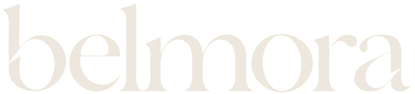
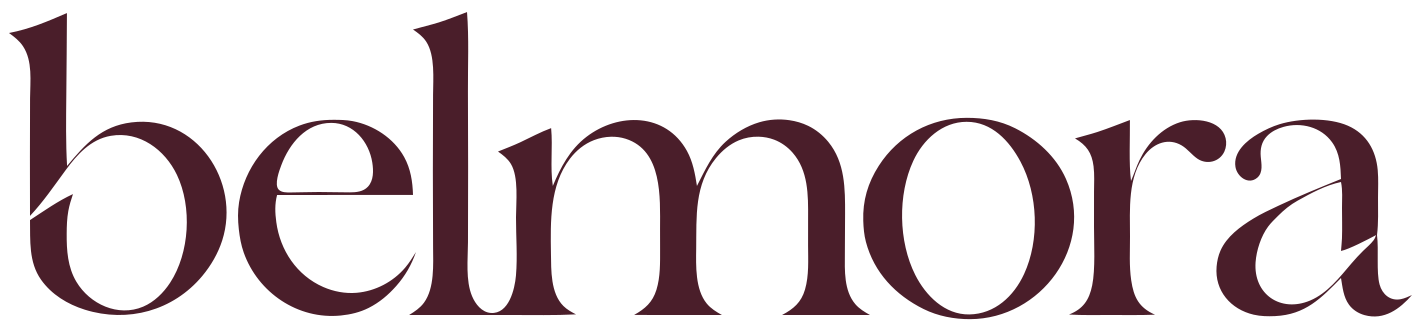
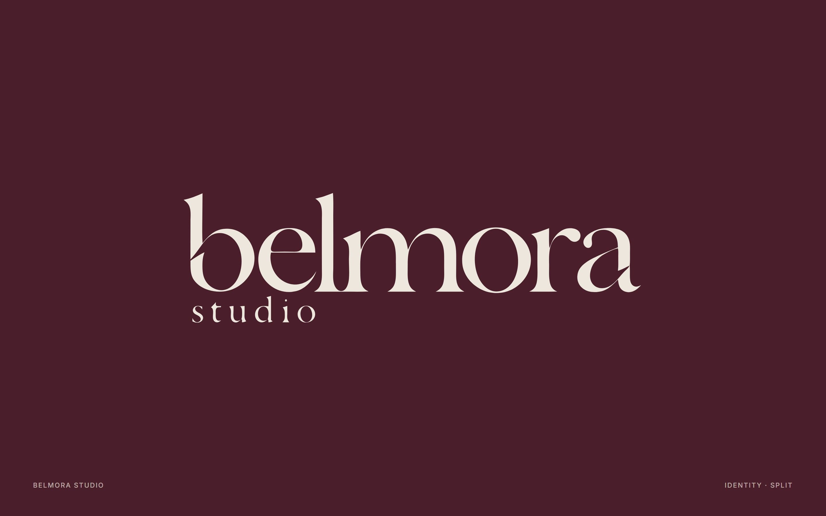
Our own identity: a lowercase wordmark with two precise cuts, mulberry on limestone, and an editorial serif.
- Client
- Brand identity
- Status
- Our own identity
- Year
- 2026
- Scope
- Name and story, Logo, wordmark and symbol, Typography and colour, Business card and social, Brand guide
The name
Belmora, said bel-MOR-ah. Bel for beautiful, mora for a place to stay. It is a name story more than a translation, and it is meant to sound like a house.
The mark
A lowercase belmora with studio beneath it. Two rising diagonal cuts, one in the b and one in the a, are the signature. The split b alone becomes the symbol for avatars and the favicon.
The system
Limestone as the canvas, mulberry for the logo and feature panels, ink for text, travertine for quiet panels and a little brass for hairlines. Boska for headlines with real italics, Inter for everything you read and click.
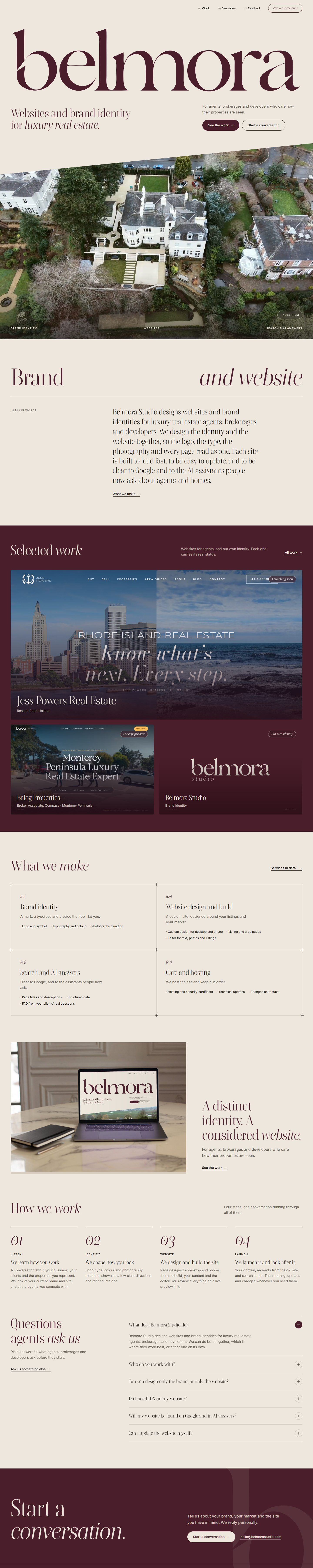

This website is the first place it lives.
Next projectJess Powers Real Estate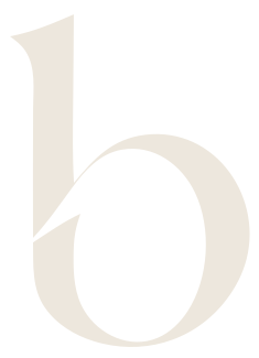
Start aconversation.
Tell us about your brand, your market and the site you have in mind. We reply personally.